
Hello!
It's that time of the month again! Time for another Crafty Friends Blog Hop. If you have not joined us for one of our hops before, the Crafty Friends Blog Hop is a group of friends who have all shared some common crafty beginnings, and we hop each month with a spotlight on a company we love.


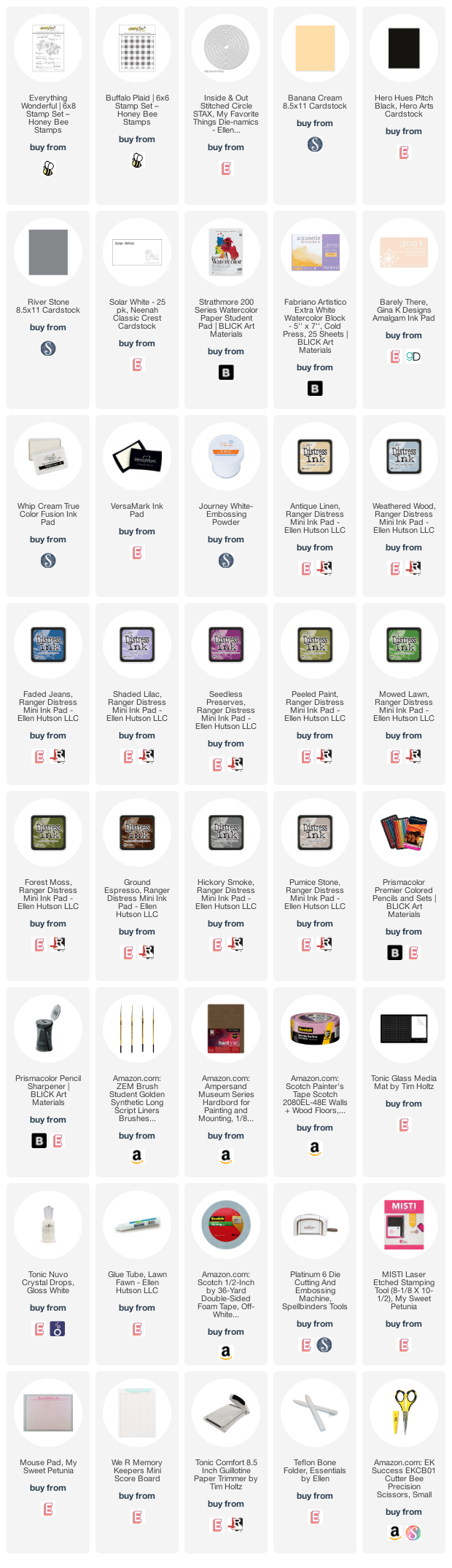
I actually have two cards to share with you today. I fell in love with the Everything Wonderful Stamp Set, and that gorgeous cluster of roses, and I had to color it twice. All supplies used, are listed at the bottom of this post.

The first card began by stamping the Everything Wonderful Stamp Set image, in Barely There Amalgam Ink, onto a bit of Strathmore Watercolor Paper. I had heard that colored pencils worked really well on a smoother (hot press) watercolor paper, because it does have a little more tooth than typical coloring paper - allowing you to build up more color for a richer look. I did not have any hot press paper to try this on, but the Strathmore paper is fairly smooth compared to most of the cold press papers that I had. It did require multiple stamping, because of the texture, so a MISTI is a must!
Once stamped, I colored in the image using Prismacolor pencils. I colored multiple light layers, building up the color and blending, before using a final coat of pencil to burnish the paper and smooth out everything. Once completed, I fussy cut the image out (There is a die, if you are less enthused about fussy cutting!).
Prismacolor Pencils Used:
(in no particular order)
914 Cream, 942 Yellow Ochre, 940 Sand, 926 Carmine Red, 928 Blush Pink, 1001 Slamon Pink, 1008 Parma Violet,
289 Grey Green LIght, 912 Apple Green, 909, Grass Green, 908 Dark Green, 945 Sienna Brown, 946 Dark Brown,
1070 30% French Grey, 1074 70% French Grey, 1076 90% French Grey, 938 White

I wanted a little texture on the background of the card front. So, I stamped a piece of Banana Cream card stock with Whip Cream ink, and the Buffalo Plaid Stamp. This added a subtle pattern. Then I die cut a circle from white card stock. I layered the colored image with the circle and background, using foam tape. I stamped and heat embossed the sentiment in white on a bit of Pitch Black card stock, and adhered that to the card front with a bit of liquid glue and foam tape. Once the card front was attached to a white card base, a few white Nuvo drops finished the card.

For the second card, I wanted to color the image with watercolors. I adore the look of watercolored florals, and while, I have played around with watercolor here and there, I really have not delved very deeply into playing with, and learning, the medium. You can only learn by doing, however, so I grabbed a sheet of watercolor paper, and stamped the image.

I stamped the image in Antique Linen Distress Ink (multiple times again, in the MISTI), onto Fabriano Artistico Extra White Watercolor Paper. This paper is a bit heavier weight, and has a bit more tooth, than the previous paper I used, making it more suited to the wet medium. I taped the panel onto a hardbord, so I could move the panel as I painted.

I used Distress Inks to paint the image. I pressed each ink pad onto my glass mat to create a spot of color that I could pick up with a brush to paint. I wanted to make sure that my image felt cohesive, so colors from one portion of the image, show up in varying amounts elsewhere in the image. For instance, the pinky-purple tone (Seedless Preserves) I used on the roses, is also adding some color variation to the leaves, and was splattered on the background. So that color appears throughout the image, tying the whole thing together.
Distress Ink Colors Used:
(in no particular order)
Weathered Wood, Faded Jeans, Shaded Lilac, Seedless Preserves, Peeled Paint, Mowed Lawn,
Forest Moss, Ground Espresso, Hickory Smoke, Pumice Stone

Once the image was completed, and dry. I trimmed down the panel. I white heat embossed the sentiment onto a bit of River Stone card stock, and adhered it to the watercolor panel with liquid glue. Then I attached the card front to a white card base. A few white Nuvo drops completed this second card.
I really like how both cards use the same image, embellishment, and even the sentiments are similarly done, but the cards each have their own "feel". Do you have a favorite?
The next stop on the hop is Lydia, over at Understand Blue.
For your convenience, here is a list of all of the stops today, just in case you get turned around.

Sara Sherlock (You are here!)

Thanks for stopping by!

Use this easy list to find the products I used in my projects. (Contains affiliate links - where I earn a commission from purchases made from my links, at no cost to you. Your support helps me keep this blog going, and continue to create - Thank you! Affiliates and disclosures can be found here.)
Please note, when possible, I try to offer multiple sources for the items I use.
Stunning cards, Sara! Wow!
ReplyDeletewow your cards turned out STunning, you did an amazing job on the watercoloring, I'm so impressed
ReplyDeleteUnbelievable, and I SHRIEKED when I saw the purple one. You are amazing.
ReplyDeleteWow oh wowwie wow! Serious beauty in those cards!
ReplyDeleteTHUD! These are beautiful! Stunning! I can't even begin to know how to color like this!
ReplyDeleteWOW! These are truly stunning! Such beautiful work!
ReplyDeleteAmazingly beautiful, Sara!
ReplyDelete